Every year MARK tackle the visual identity for Manchester Literature Festival (MLF) – and every time they do something clever and appropriate. MLF is one of the biggest and best urban literature festivals in the UK; a showcase of the very best in contemporary writing from across the world. And this year (the 11th year, no mean feat in itself) MARK have surpassed themselves with a visual identity based around the visual distortions of book edges. A simple idea but one that has infinite legs.


Most hotels want you to spend time in them. But when you’re in the heart of the city, why stay cooped up in your room? Branded by Ragged Edge – Assembly is a new hotel brand that encourages its guests to get up and go. It’s all held together with an eclectic bespoke typeface, but the real difference is the copy – telling people not to stay in your hotel, but to get out and explore instead is fresh and ballsy. Love it.


An ancient City Guild, The Fishmongers’ Company has upheld standards in fish trading for more than 700 years. The Company recently created certification to celebrate professional excellence and approached Freytag Anderson to create the visual identity for the new Master Fishmonger Standard. They’ve created a lovely simple ribbon / fishtail marque for starters, but the main dish is the beautiful imagery created by printing with fish – inspired by the gyotaku technique used by Japanese fishermen.


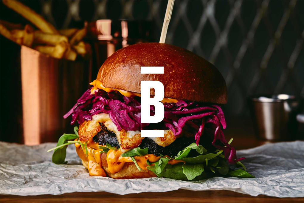
A lovely typographic identity for a no nonsense burger restaurant. A brutally simple name that deserves a brutally simple idea – by sandwiching type between two dashes Freytag Anderson’s identity immediately communicates all you need to know. The special sauce on this one is the cheeky copy and lovely playful typography. Spot on.


Really dig (pun intended) this new identity for Millbank Farm by Jack Renwick Studio. A family-run farm on the same site since 1889, producing top-quality turnips, leeks and chickens. A great logo based on the furrows leads to a bold graphic lino-cut style illustration approach that feels just right. Great strapline too.


Really digging this packaging for Firefly – a botanical cocktail drink in collaboration with mixologist Mr Lyan. B&B studio have taken original botanical book illustrations and added colour and texture to make them more contemporary. But the brave bit is that the illustration takes over the front of the bottle, pushing the brand name to the back. Turning traditional beverage packaging on its head whilst providing a level of intrigue and innovation. Love it.


The simple playfulness of this Bog Eyed Books identity is absolutely spot on. Bog Eyed is the brainchild of renowned children’s book author and cartoonist Gary Northfield and his Wing Commander Nicky Evans. Gary and Nicky decided to create a platform to service the current boom in British comics for children. Baxter & Bailey say ‘With a gift of a name, the logo almost designed itself’. The best ideas usually do …


London’s airport duty free shops tend to be filled with horrible products covered in bad London clichés. This range of teas from The London Tea Co take this clichéd language (beef eaters, city bankers, policemen etc) and create a charming set of collectible tins. Based on the simple idea of the classic consequences game – combining heads, bodies and legs to make fun combos and lend a memorable twist.


